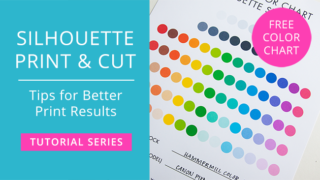
In this video in my Silhouette Print & Cut tutorial series, I’ll share some tips for getting better print results when printing from Silhouette Studio.
First up, I talk a little bit about the two major color modes that you’ll encounter when working with any design software, and those modes are RGB (Red / Green / Blue) and CMYK (Cyan / Magenta / Yellow / Key (Black)).
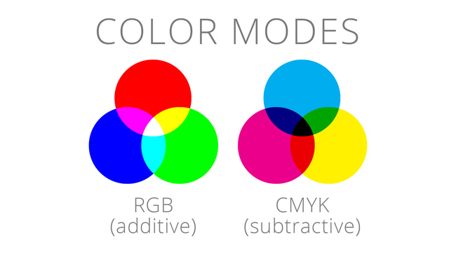
The RGB color system is based on light. It’s called an “additive” system because the different colors are created by adding and mixing different variations of red, green, and blue light together. The more light that you add, the lighter the color will be. So, you can see in the image above (left), in the center area where all of the colors overlap at their highest intensity, the color that you get is white. Because RGB colors are communicated via light, the RGB color mode includes many super bright and vivid colors that you cannot get with the CMYK color mode, so the RGB spectrum offers a larger range of colors overall.
The CMYK color system is what is called a “subtractive” system and is based on pigments and how they’re either absorbed into or reflected off of a surface. Another name for it could be an “absorbative” system. You can see on the image above (right), in the center area where all of the colors overlap at their highest intensity, the color that you get is black. This is because black absorbs all color, so you can throw the max amounts of cyan, magenta, yellow, and black in there, and black will absorb them all. Different colors in this system are created by subtracting and mixing different variations of the four pigments, so the more pigment you subtract, the lighter the color or tone will be (in other words, lighter colors absorb less and reflect more), and when you subtract the max amount of all of the four pigments, you end up with the color white, which reflects all color and doesn’t absorb any.
Because printed surfaces like paper and fabric don’t emit light, colors in the CMYK system don’t tend to be as bright or vivid as colors on the screen, and the overall color range is more limited than the RGB system is.
In Silhouette Studio, you don’t have the ability to switch between color modes like you do in design software like Adobe Photoshop and Adobe Illustrator, but you can import clipart and images in either of the color modes and work with them in Studio.
Since Silhouette Studio offers less color management options than other design software, if you’re getting less than stellar print results when printing for print & cut projects, you can use some other tricks to adjust your image for better color results.
Your printers preference and options window will pop up when you click to print, and making changes to certain settings in this area that can make a big difference in your print results. Different brands of printers offer different print preferences and options, so what you see in your printer dialog window will be different than what I see in mine, unless we have the same printer. For my inkjet printer, which is a Canon Pixma iX6520, one option that makes a noticeable difference in my results is the Print Quality option. When I set it to High (vs. Standard), my colors are richer and more saturated. So, if you’re experiencing prints that are on the light site or a little bit washed out, try setting your printer to the highest quality print setting.
You may also have options for adjusting color tints, contrast, and intensity. Unless you’re noticing that your printer is consistently printing colors with, say, a green tint, or colors aren’t as intense or rich as you’d like on a regular basis, I would recommending making adjustments to individual images in your design software instead of changing settings within your printer because doing something like adjusting a color tint and leaving your printer set that way could actually cause images that would otherwise print fine to have color casts. But settings like contrast and intensity are definitely an option if you’re noticing that your images are too light or washed out in all of your print results.
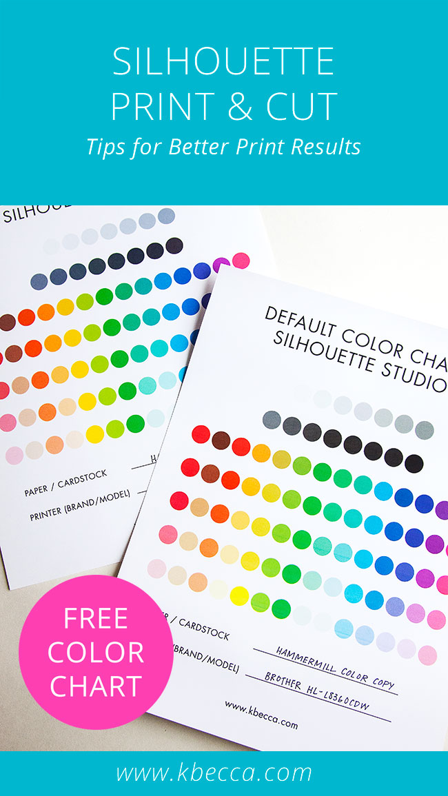
Another good idea is to make test prints. I have a FREE printable .studio3 file with a color chart for the default Fill Panel options in Silhouette Studio that you can download below and use for your own test prints. I’ve included fill-in areas for paper / cardstock type and printer brand / model, too. I print this color chart on the brands of cardstock that I use most often so I can see how those default colors look when printed out.
In the video, I’ll also show you how to make subtle adjustments to images using the Image Effects Panel in Silhouette Studio, and these small adjustments can definitely make a big different in your printed results.
Check out the video below for tips on getting print results with Silhouette print & cut:
Supplies Used in This Project
The following supply list contains affiliate links. I make a small commission if you purchase through these links, and I really appreciate it if you do!
– FREE Printable Silhouette Studio Color Chart
– Hammermill Color Copy Digital Cover 80lb.
– Neenah Solar White 80lb. cardstock
– Brother HLL8360CDW Color Laser Printer
– Canon Pixma iX6520 Printer
– Cupcake Cuties Christmas Clip Art
such a helpful series – thank you!
So glad you’ve been enjoying the series, jill!
Thank you. I have been trying to figure out why my images were so dull.
Glad that it was helpful for you, Amy!
What about reds printing orange and greens printing blue??
I’m having this trouble, too!
Jessica and Veree – There are a number of possibilities for why this might be happening. It could be that the monitor that you’re using isn’t calibrated properly, or it could be that you have either clogged heads on your printer ink (if you’re using an inkjet) or cross contamination on your toner cartridges (f you’re using a laser printer). Or it could be that an incorrect color profile is being applied when you print.
To start, you may want to try cleaning your printer ink heads (if you’re using an inkjet printer – this is usually an option in the printer software) and/or checking out your ink / toner cartridges to see if there’s anything going on there that might be the source of the issue.
I’m trying to print a particular shade of blue. When I sent the RGB values in Silhouette and print…it’s a completely diff shade of the same RGB value if I print from Adobe Illustrator. How do I get the colors to match??
I am having trouble with colors like black and red when I design in Silhouette and then print on a sawgrass sublimation printer and not sure what to do.
Many thanks for your video. I was having problems with my colours but all sorted now x
Hi when I print from silhouette I get 4 blue lines through my print out why is this happening